Re-designed Figshare, a research data repository, to be more scalable, usable and compliant with WCAG 2.1 AA and Section 508
Read more
My work for Figshare’s accessibility redesign
The mandate
Figshare’s main customers are universities and scientific publishers. Most of them are government-funded, which means taxpayer-funded.
- In 2018, new UK and US mandates set a hard deadline: government-funded digital products had to meet WCAG 2.1 AA in Europe and Section 508 in the USA by the end of 2021
- To remain a viable repository for much of its customer base, Figshare had to become accessible by September 2021
- We started by getting the whole team, design and development, fluent in web accessibility
- WCAG isn’t a checklist you apply, it’s a set of constraints you have to understand before you can design and code against them
Gathering usability issues and conducting a UI audit
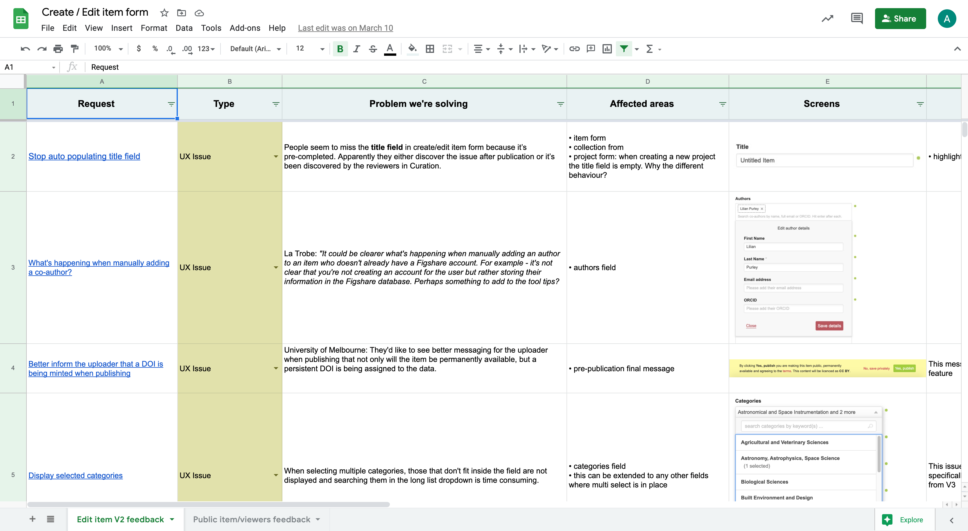
In parallel with accessibility education I centralized two years of usability issues from support tickets and client calls, then ran a UI audit with the team to establish where every component stood, in design and in code.
- Two years of support tickets and client calls, synthesized into a full component audit
- Analysis and synthesis of the research findings in Dovetail

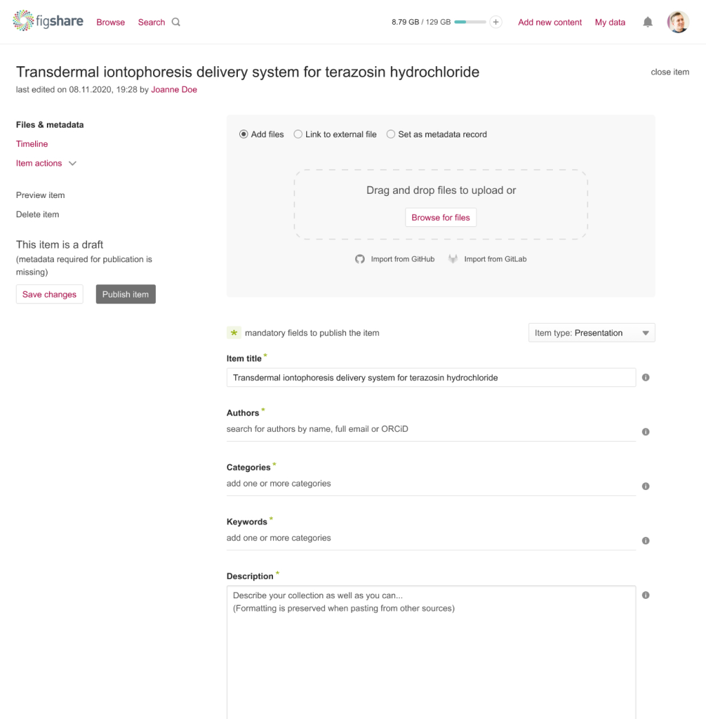
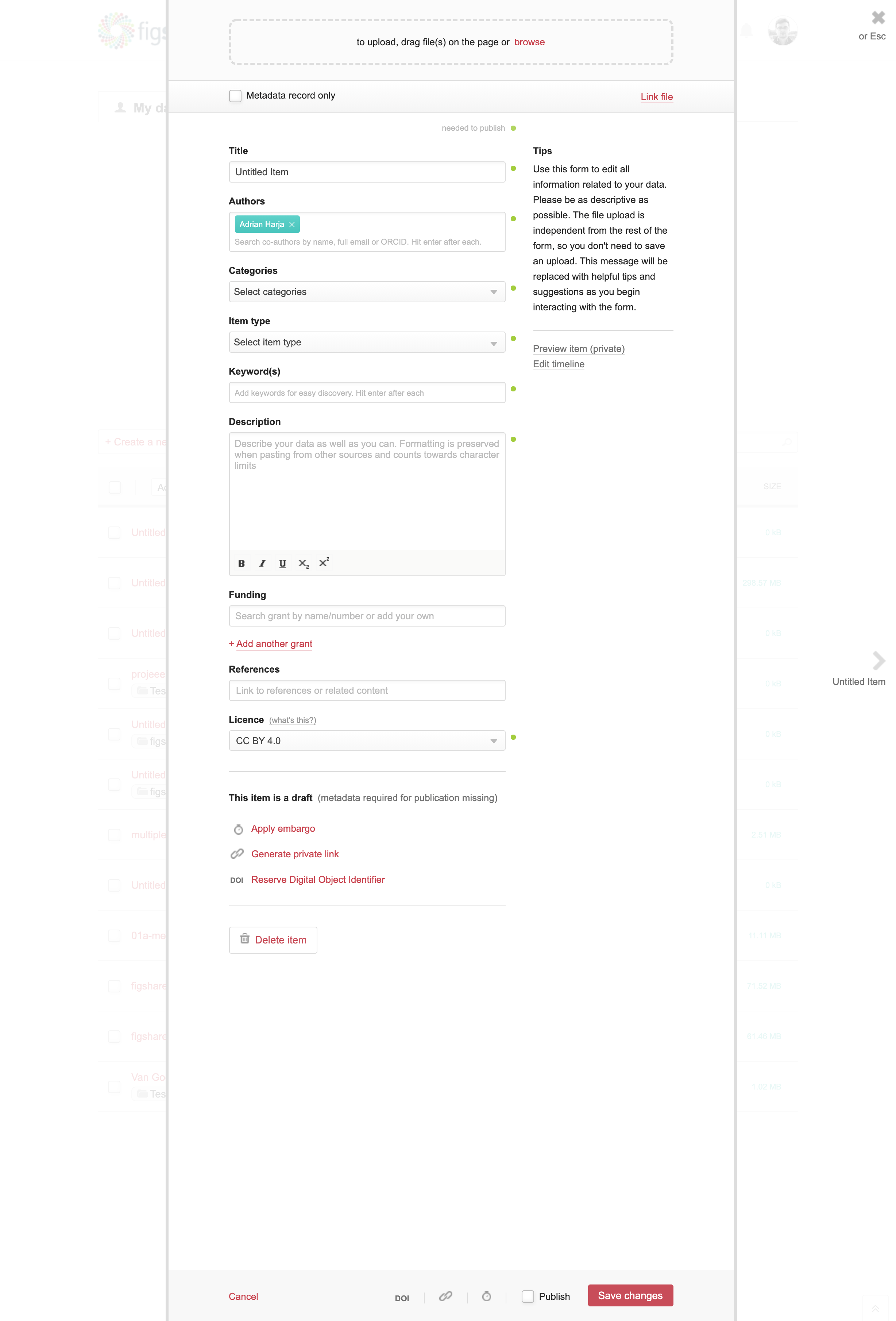
Original item form
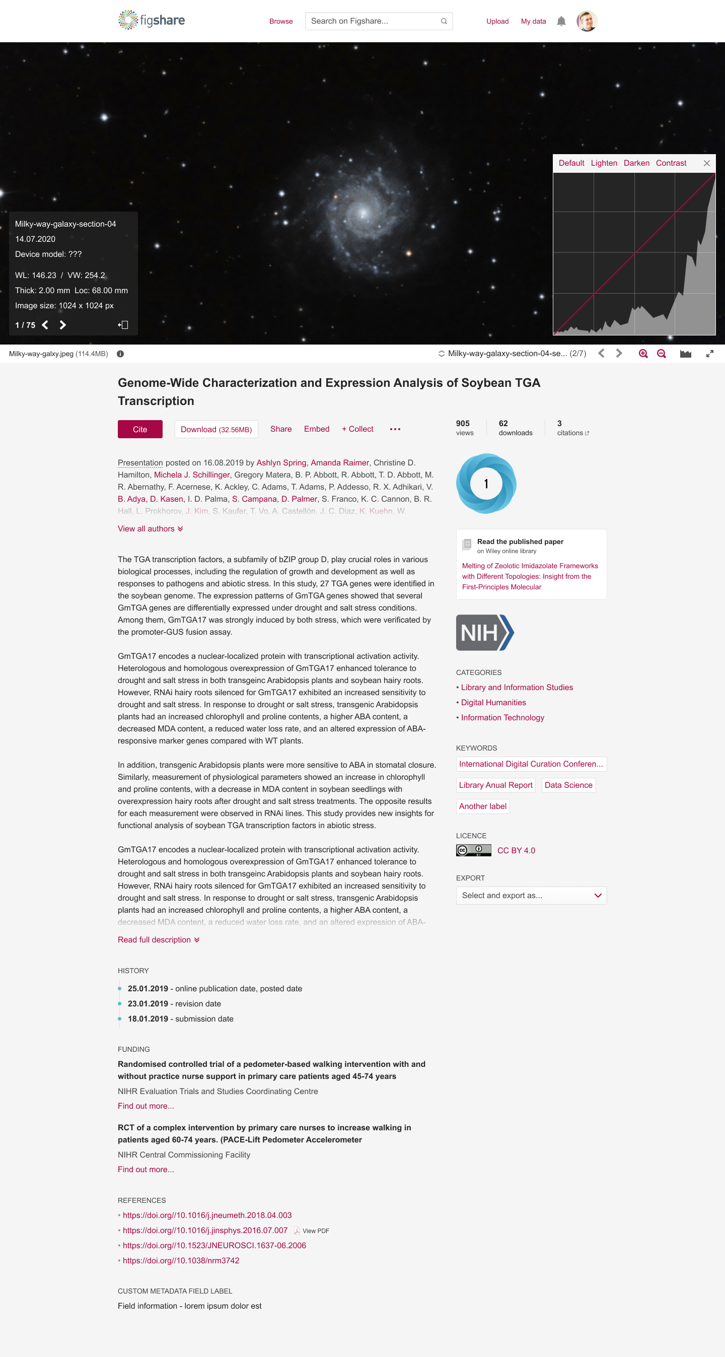
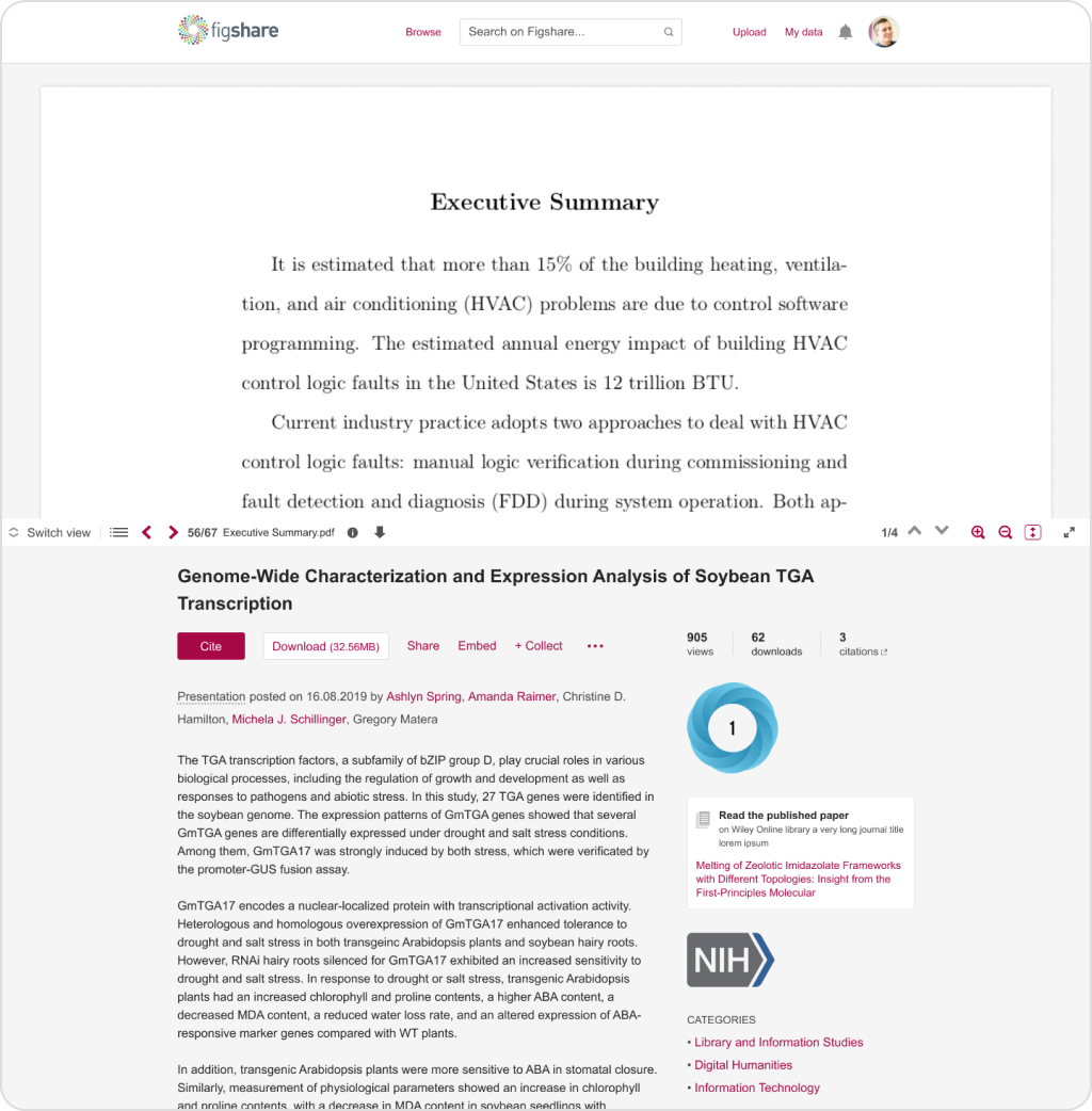
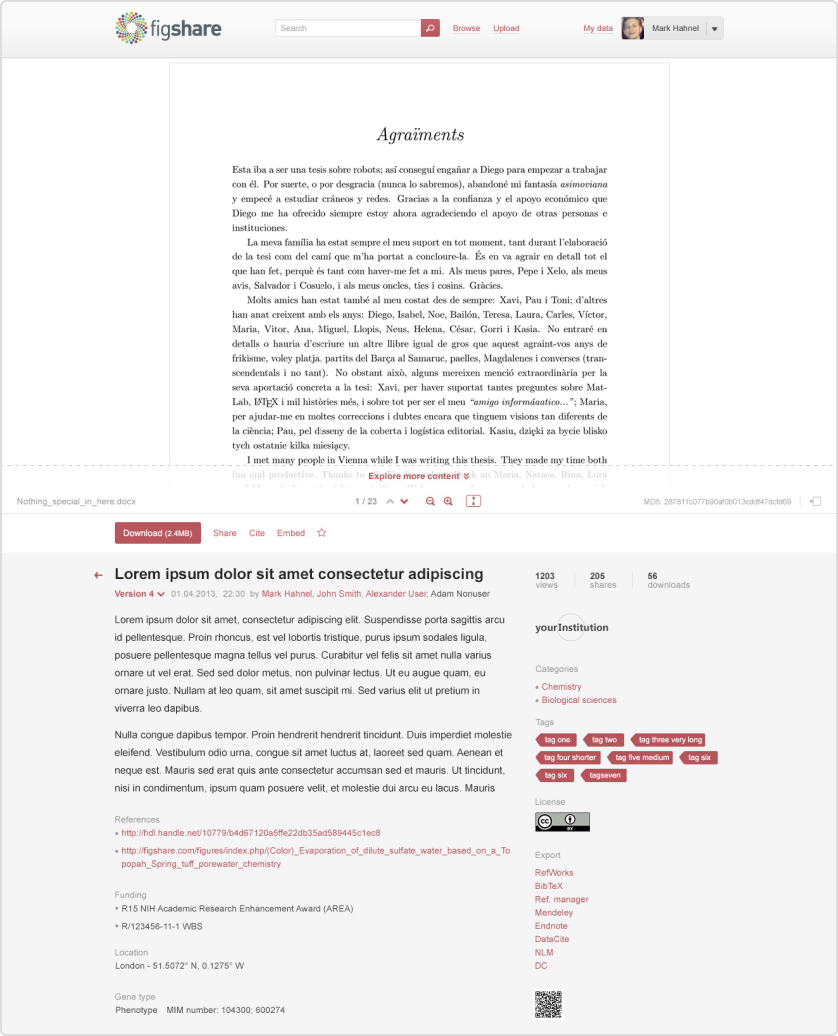
Original public item page
Analysis and synthesis of research findings in Dovetail
Ideation, sketching and prototyping
One issue outranked the rest. Creating an item, which is research data uploaded, described through a long metadata form and rendered as a public page, is the core of the product. It was failing on colour contrast and keyboard navigation, had unresolved usability issues and no room to scale, so it went first.
- Prototyped several directions for the item flow and put them through 3 rounds of user testing, in person and remote
- Each round ran off a written test plan with an explicit list of assumptions, tracked live so we knew which survived contact with real researchers
- Findings went into Dovetail, and each round informed the changes tested in the next
- A new version of a core feature, tested and validated with users, plus multiple validated components of the new design system
- A deeper understanding of the researchers’ mental models
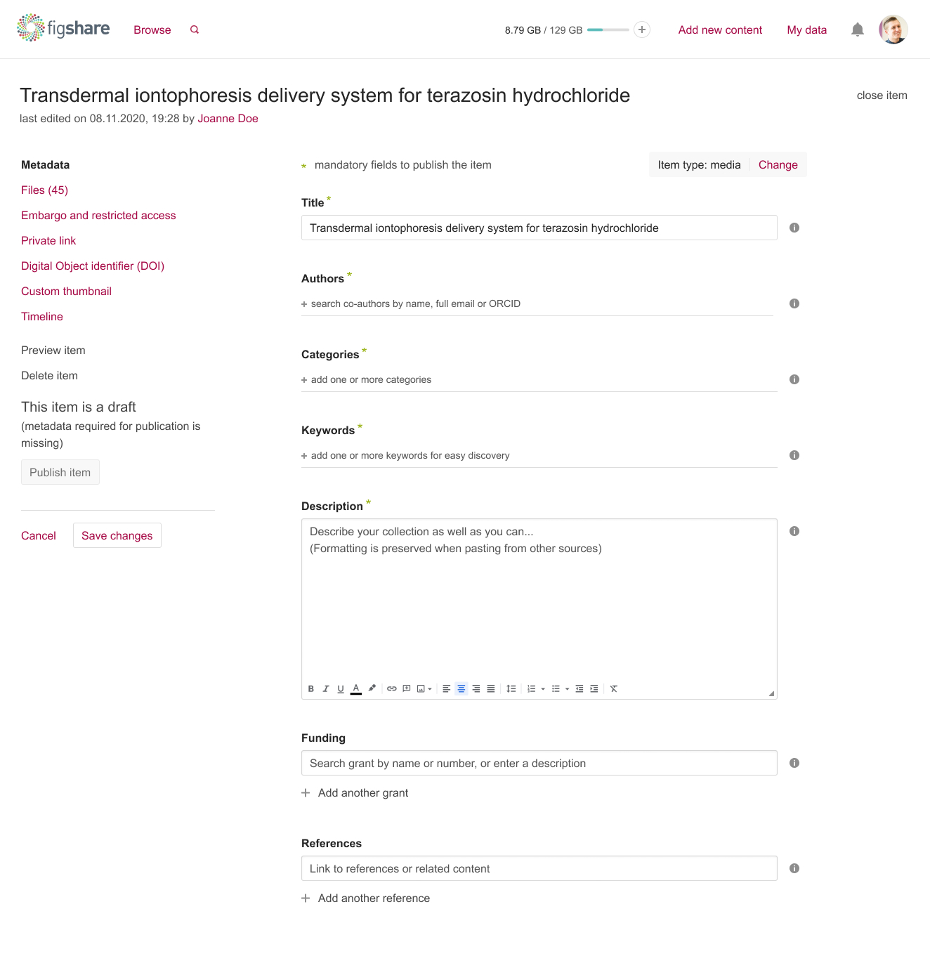
First iteration of the item form
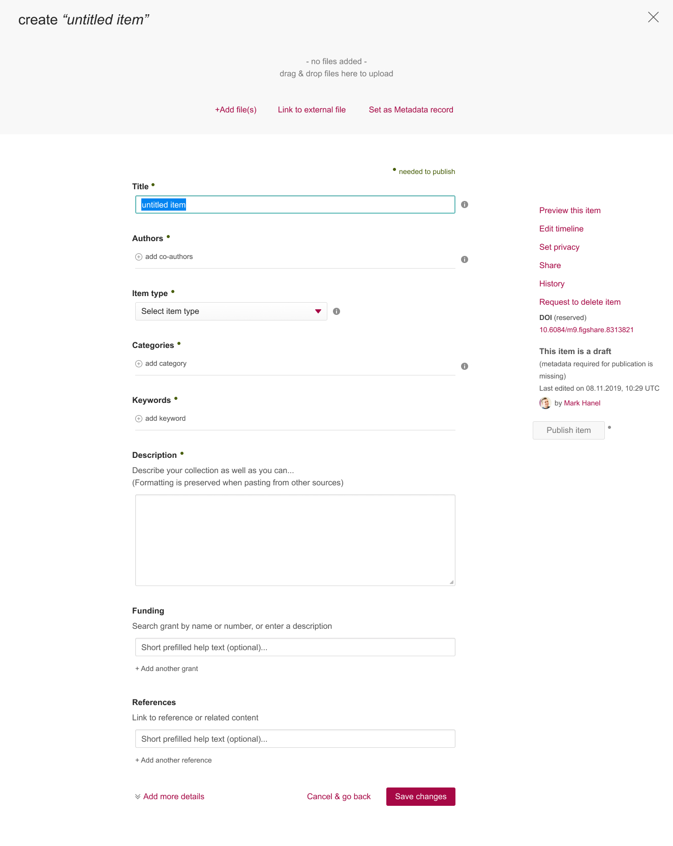
Second iteration of the item form
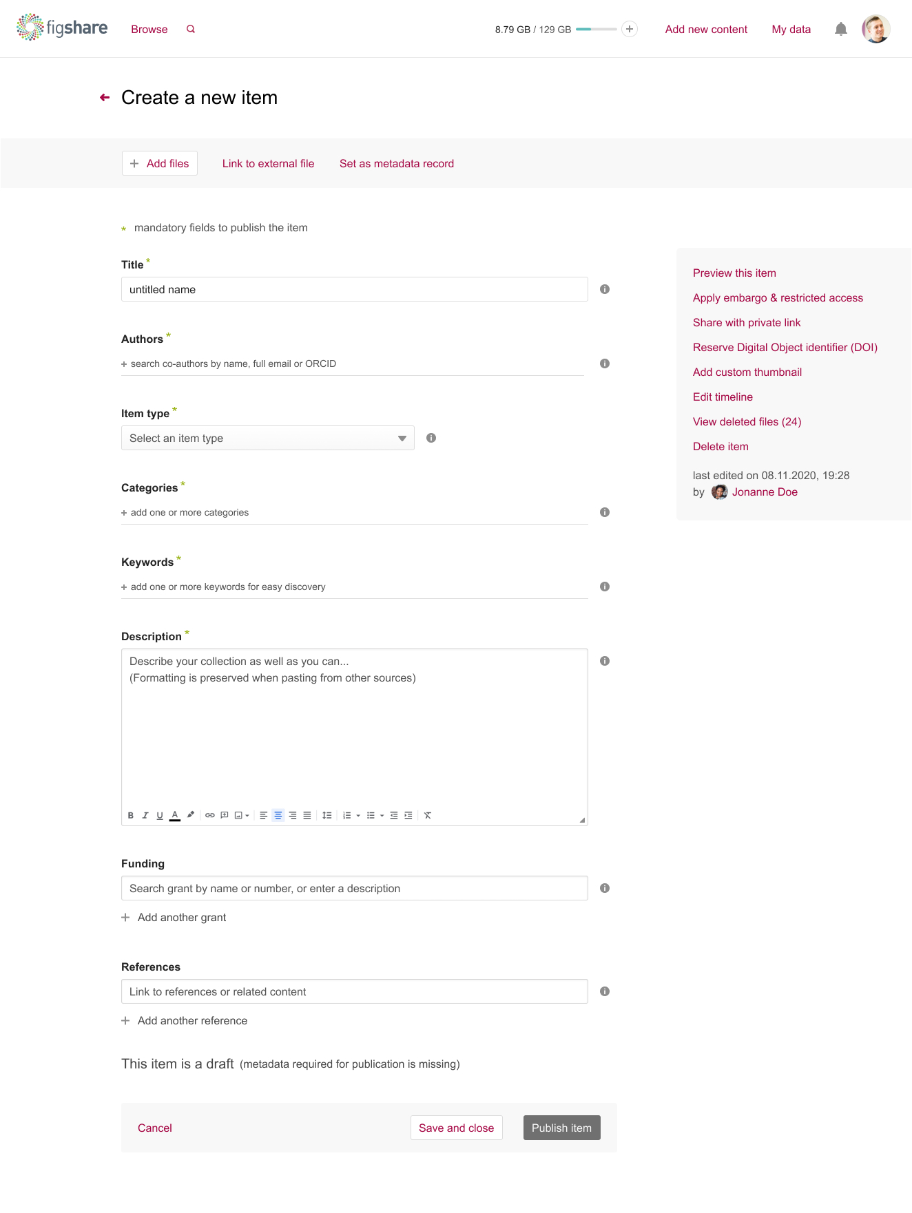
Third iteration of the item form
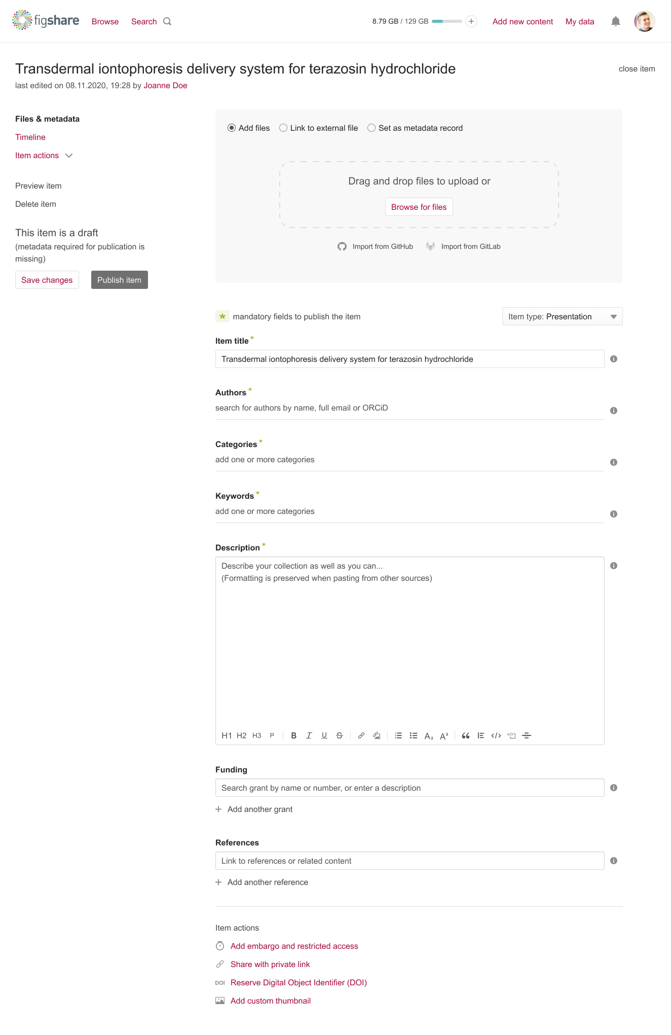
Final iteration of the item form
Final iteration of the public item page
Building Figshare’s design system
In parallel I defined the design system underpinning the product. It covers all the success criteria of WCAG 2.1 AA and some of the Level AAA requirements.
- Passes the AAA colour contrast requirements
- Easily accessible via mouse, keyboard only and screen readers
- Large enough in font size and in click and hit area to work for people of all ages and mobility impairments
- Meaningful context around each element of the page, and consistent, multiple ways of navigating the product
- Foundations set with my 2 UX colleagues: a new grid, custom icons, accessible colours, a refined type scale and spacing rules
- Atomic components built with the lead front-end developer, then complex components, layouts and pages with the wider team, each reviewed in Storybook so design and code never drifted apart
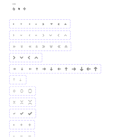
Design system - atomic components: icons
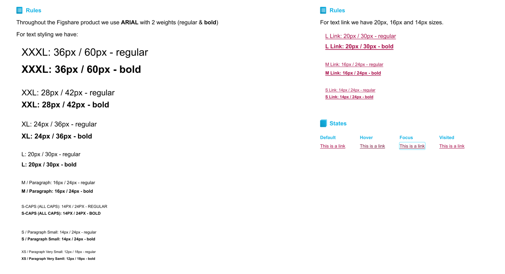
Design system - atomic components: typography
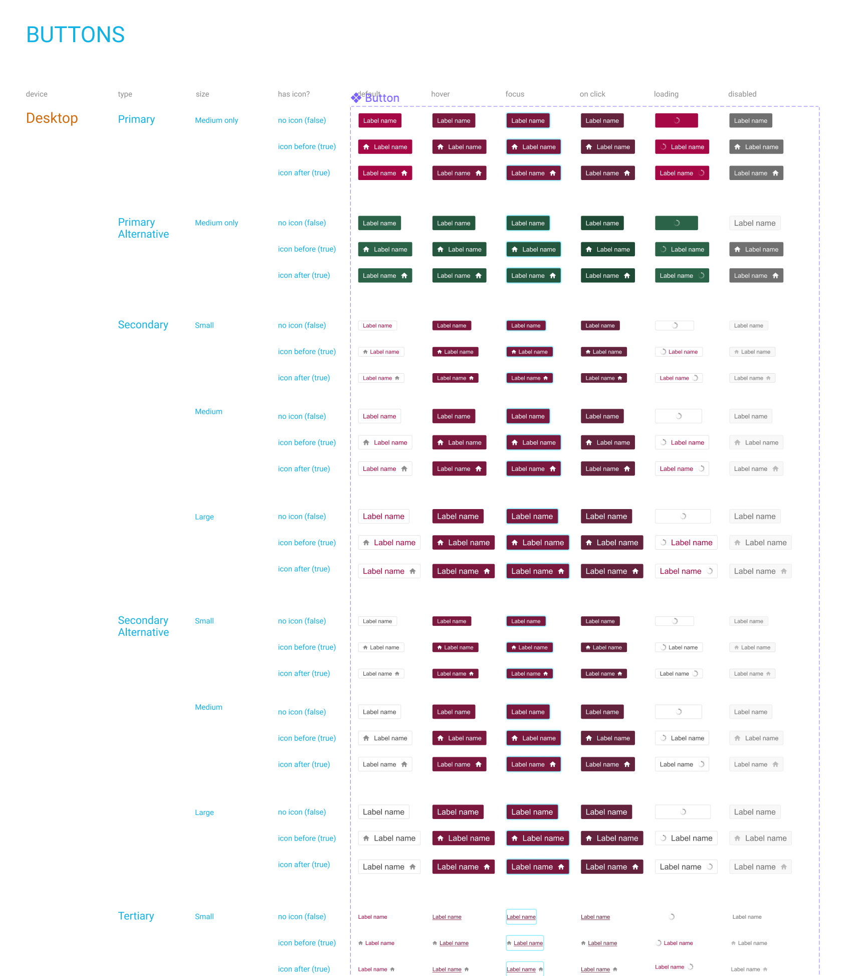
Design system - atomic components: buttons
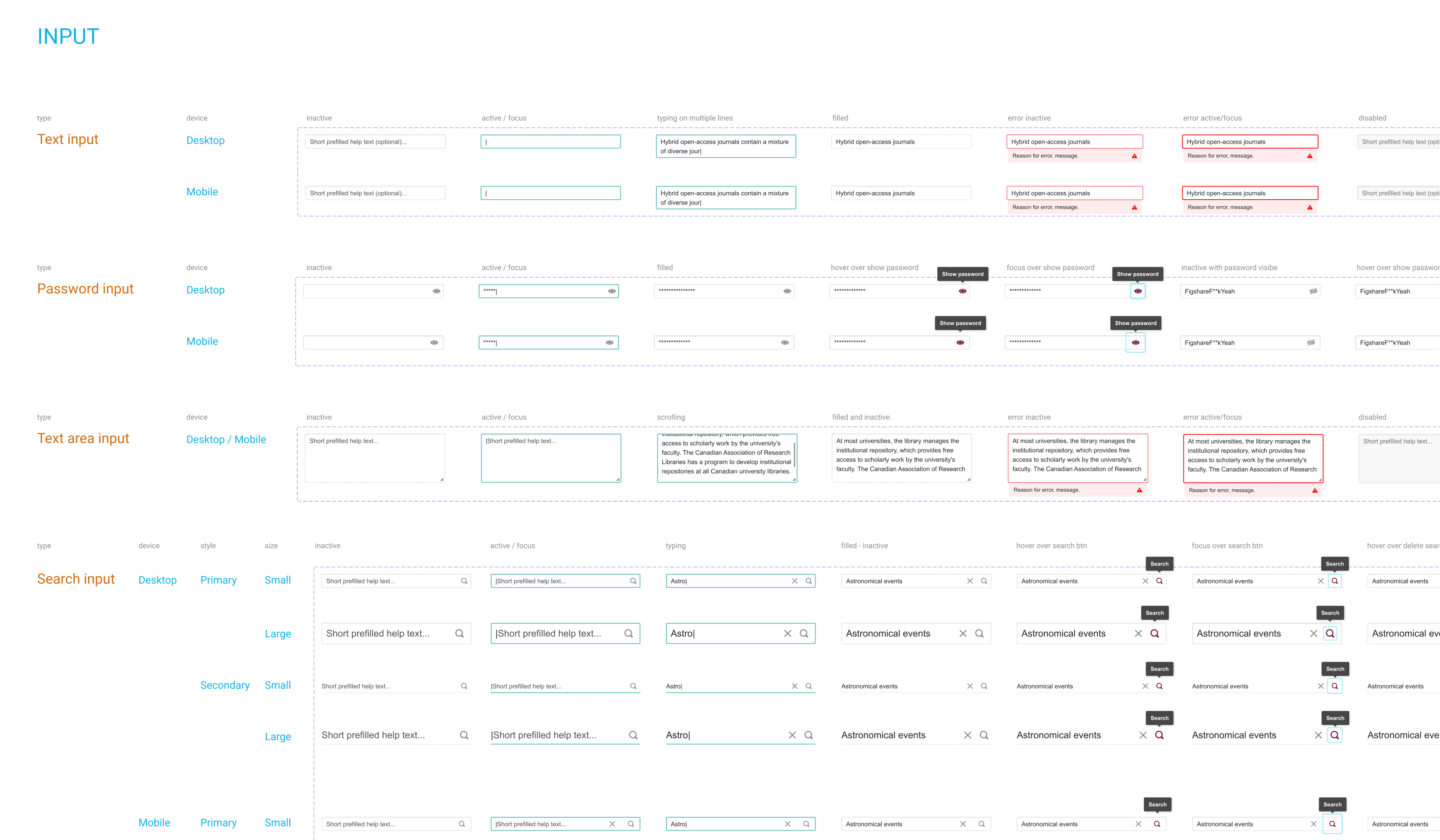
Design system - atomic components: input fields
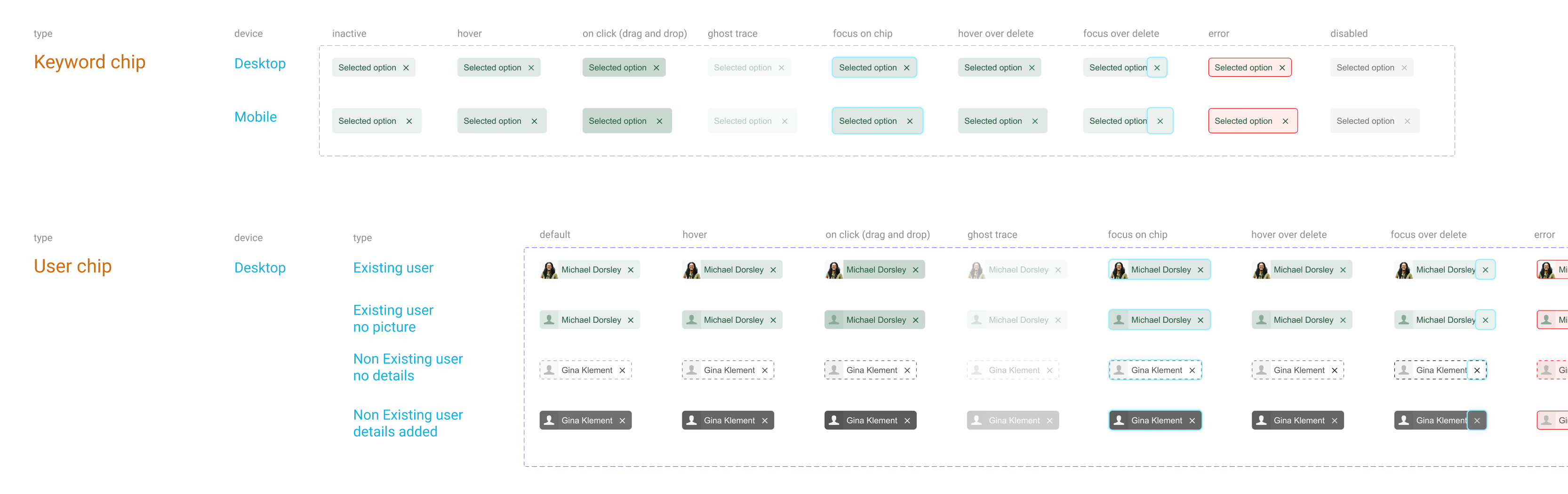
Design system - atomic components: chips
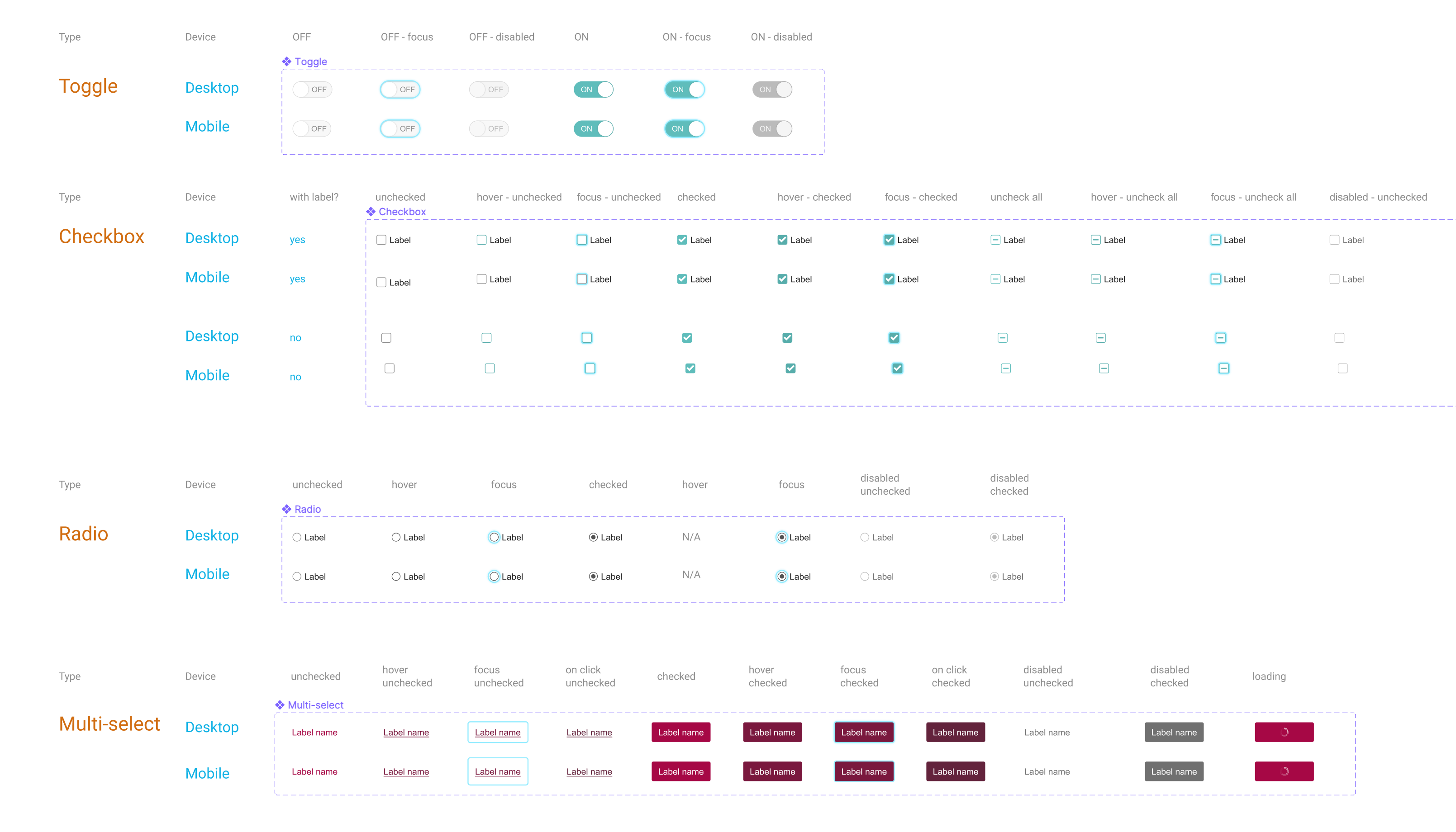
Design system - atomic components: selectors
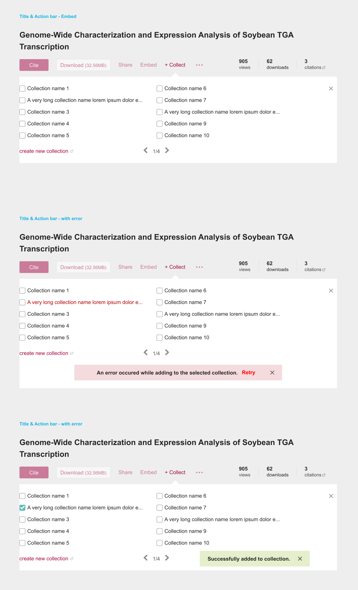
Design system - complex components: a core feature
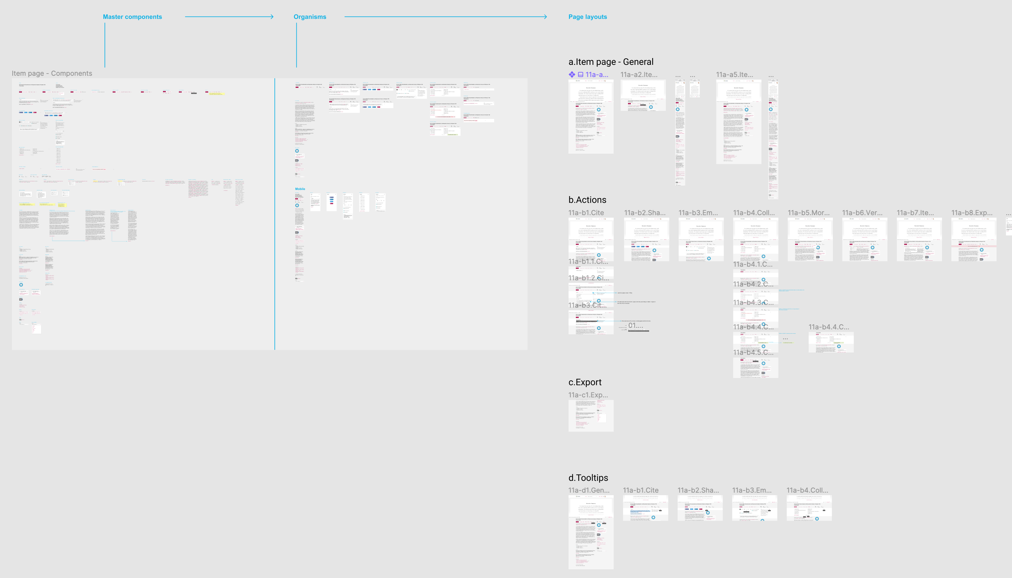
Design system - complex components: master component
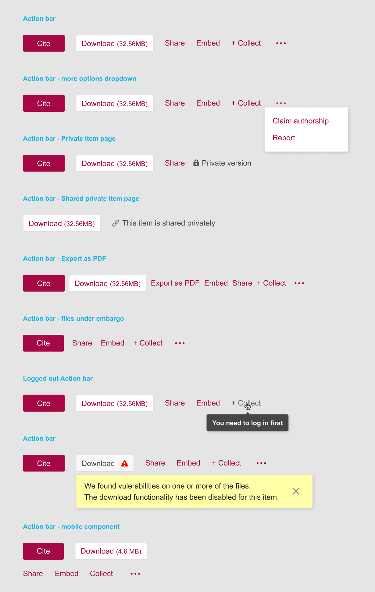
Design system - complex components: template and organism
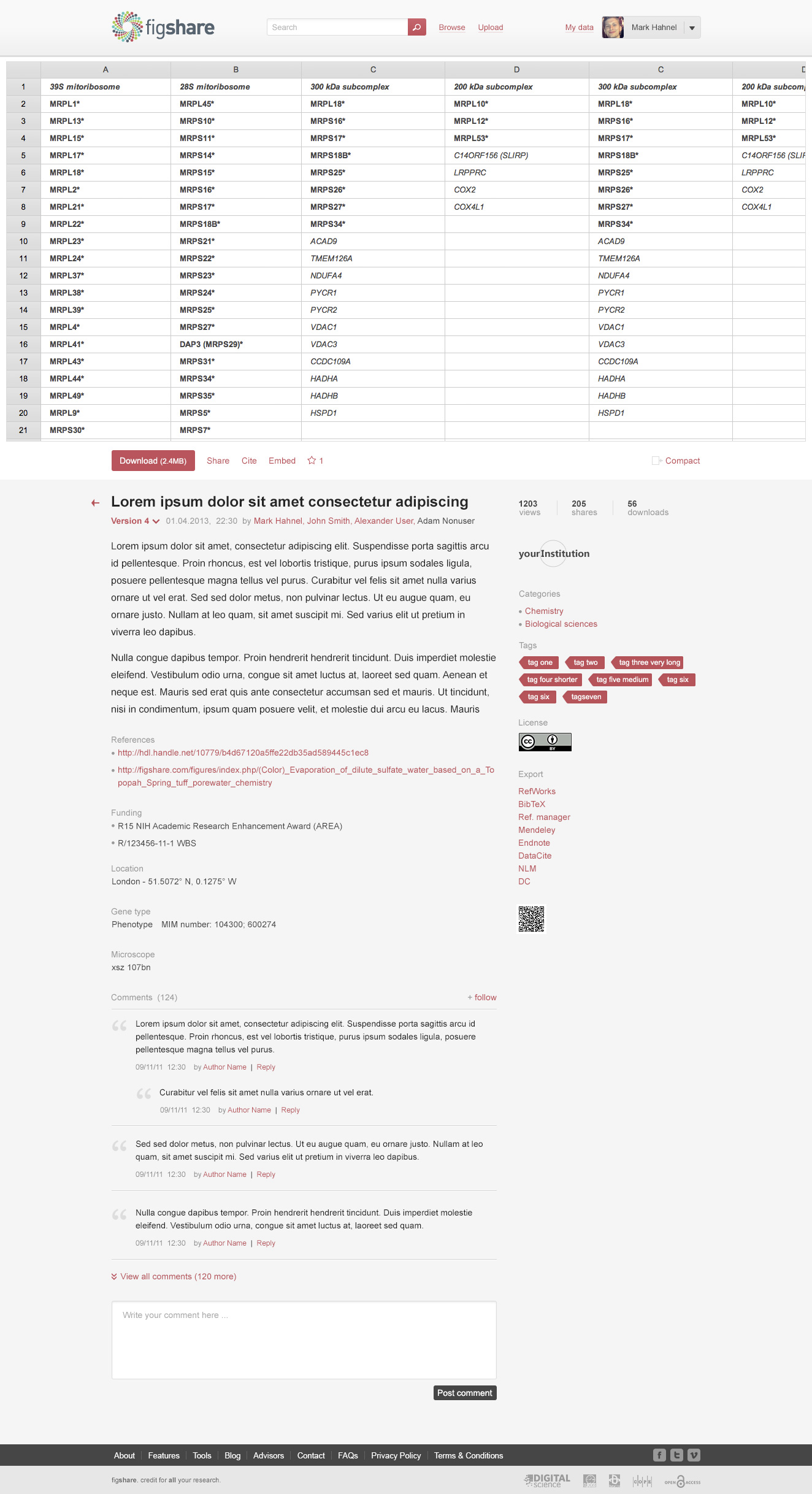
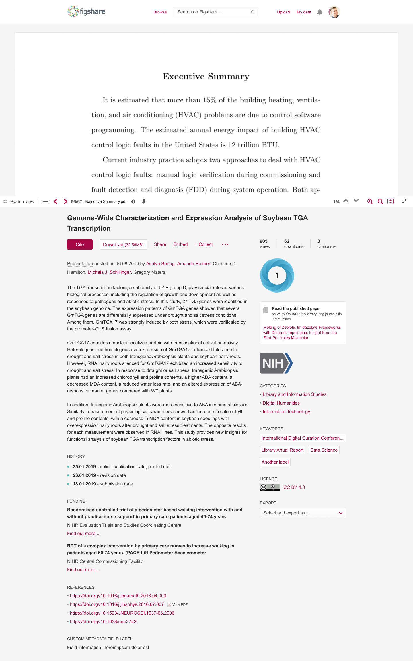
The public item page before the accessibility redesign
The public item page after the accessibility redesign
Outcomes
Two and a half years of work with a Project Manager, 3 UX Designers, 1 Business Analyst and 6 Developers.
- Prototyping and user testing became a standard step at Figshare, expected before development starts, on projects beyond this one
- A design system robust enough to update easily and adapt across scenarios, which cut the time and money spent on both design and development
- The team now takes on new projects of any size faster and with better collaboration
- Tools: Figma, Dovetail, Google Sheets and Docs, Dropbox, Illustrator
- Responsibilities: visual and interaction design; ideation, sketches and wireframes; prototyping; user testing; design system; UI audit; accessibility evaluation